Common and uncommon characteristics of the 1979 O-Pee-Chee Wayne Gretzky Rookie card
The interesting print and paper characteristics and imperfections that make an OPC Gretzky Rookie card real
The yellow Gretzky dot is so last century
Some characteristics are simply notable, fun trivia, while others can have a real impact on value, as some imperfections differ between the examples to varying degrees. This is helpful in not only providing a more granular way of differentiating PSA 9s (even 8’s, thus the 8.5), but helpful in putting an age to the card with the notion being that some issues resolve over time, and cards with the fewest or diminished marks must have been printed further down the line. The marketplace reacts to the variations in characteristics and imperfections noted here, consciously or otherwise, many people look for cards only with the blue skate-lines, and sales figures reflect this. Prices can range greatly for a PSA 9 and some of those 9’s are pretty horrible.
Another benefit of a rough-cut is that you know it isn’t fake. You can get straight-cut cards from any series, but when you get into the ’79 OPC, you’re adding yet another qualitative element that when on the right card, can generate much pride in ownership because they are almost impossible to maintain in original condition. The fibers in the cut make the card just a touch wider (in some places up to 1/16″ combined sides), so taking them in and out of holders risks damaging the hairs every single time and you can’t hold them by their edges, tough to avoid or even think about when you’re nine years old.
According to Ken McAvoy, a former factory plant manager in 1980, O-Pee-Chee was using a dull cutting blade that they set-up in the basement of their gum company. This, coupled with an apparent lack of a cutting clamp which would have kept the stack firmly in place to avoid offset printing issue which plagues this series, leaves very few perfect examples. Apparently only 10% of the cards that came off the line could have ever qualified for gem mint status since “quality was not the number one priority back then”. With a rough-cut, you know exactly what you’re getting and ultimately it doesn’t (isn’t supposed to) effect the grade, as all the graded elements of the card are found within the boundaries of the cutting area, just like every other card, but the rough edges add character; the collateral damage from being ripped apart with a dull blade. Finding a Gretzky with a nice rough-cut on both sides provides a balance to the beauty with a little framed-chaos, which on the right example, tricks the eye into seeing it is a white border. And this is the point, the best example to get is the one that adheres to all the rules of a PSA 10 while retaining all the character of a true OPC.
Many thanks to Jack Harris at the LATimes for helping to clear-up the mystery of “wire or blade”
Who’s responsible
Contrary to popular belief, O-Pee-Chee did not actually print the cards, they were just a candy company, they just made the gum. For the cards, they used Lawson & Jones Printing Company, also in London, Ontario. In the book Hockey Card Stories: True Tales from Your Favourite Players in an interview with Derek Smith, captain for the Buffalo Sabres in 1979, Derek mentions that his father, who used to work for the printing company, would pull out uncut sheets that had his card on it and bring them home as gifts. As luck would have it, he was printed on the same sheet that has the #18 Wayne Gretzky rookie card.
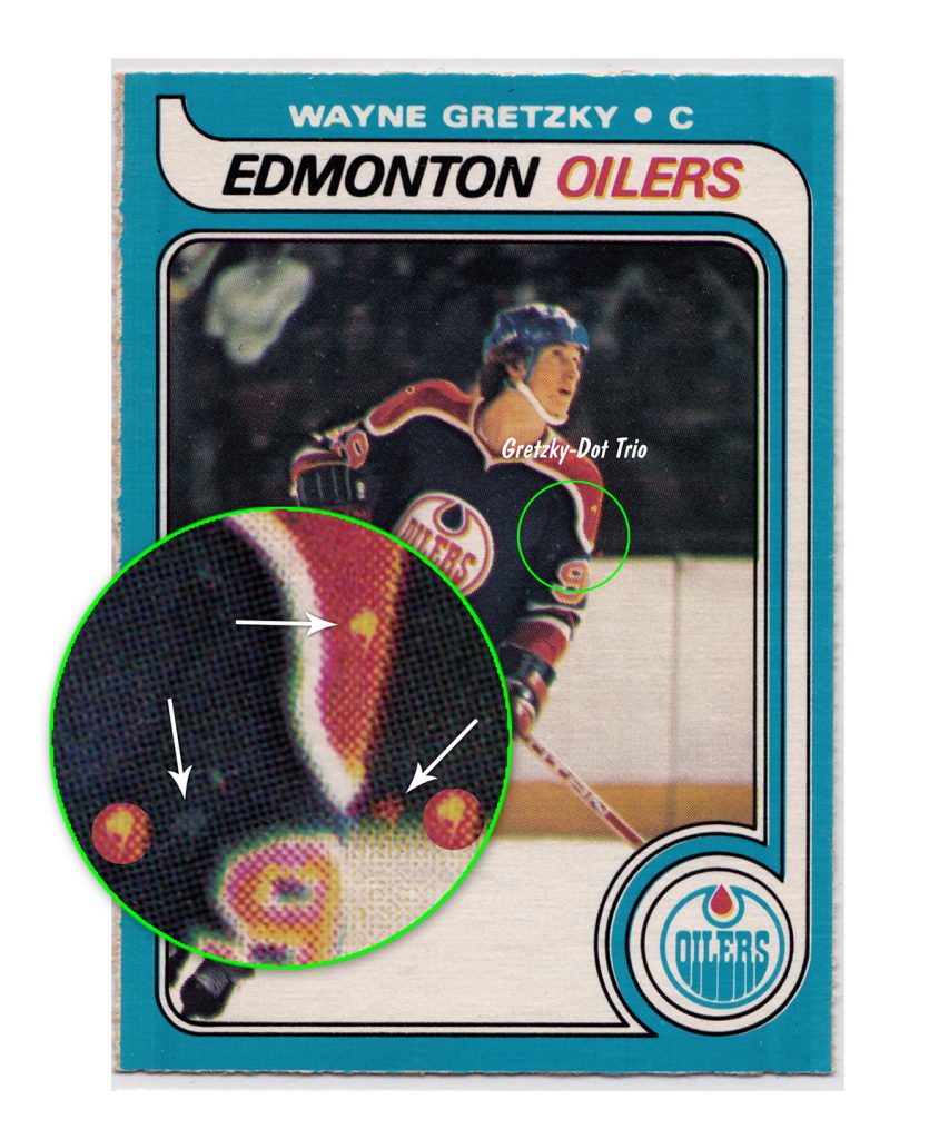
The Yellow Dot
Long-been the way of distinguishing a real O-Pee-Chee Gretzky from a fake, as it never changes in shape, brightness, size, color or placement. The yellow mark is really just an absence of red ink on top of the yellow, which when combined makes the orange. This is a “Fish-Eye” of sorts, a printing colloquialism for a Hickey, in this case, an ink-repellent particle such as a loose paper fiber caught between the printing blanket and the printed surface, and printed as a Void Hickey.
There are two other marks that appear to be similar, how they can possibly be related is beyond mystifying – one is red and further down to the right, in the notch created where his uniform and the boards meet in the image, and the other is to the left. They each seem to have the same shape and size, with a shared look of having a tail or drip extending down that dogleg’s to the left. I’ve placed the yellow dot next to each for comparison.

Right-Shoulder Fish-Eye
This is the most recognizable uncommon imperfection and only appears on just one of the four cards in the collection, and I believe to be another age-spot. Like the Gretzky Dot, this is another “Fish-Eye”, a printing colloquialism for a Hickey, in this case, an ink-absorbent particle picked-up the ink and printed as a spot, but because it had depth, it caused a “tenting” effect, and didn’t allow the surrounding area to print and showed as a Doughnut Hickey.
It only appears on (of tracked cards) 6 0f 46 PSA 9s (13%), 22 of 101 PSA 8s (22%), 2 of 9 PSA 7.5s (22%) and 35 of 143 PSA 7s (24.5%), or a total 65 of 299 for 22%. Of the four I use throughout the examples, it appears on only one, the one I consider the newest of the group, printed towards the end of the early run, a time that started generating cleaner examples.

The Smear of ’65
Visible on only a handful of cards I’ve seen, although appears to be an early cause of a number of image surface issues that have contributed to this and other possible and graded 9s from being 10s further down the line. In this examination, sadly my Gretzky card has the largest and most defined smear in any of the Gretzky cards found through my research, and so might suggest being early in the print run because this mark and secondary marks (The Floating Fleck and The Skid Mark) move and or diminish quickly, most Gretzky’s do not have any damage from this.
As horrible and regretful as this mark is, it doesn’t take away completely from the eye-appeal as it may seem, it tends to hide a bit as it runs vertically in the letters and isn’t as bad in person. The appeal of the balance of the card tends to make up for the imperfection. Find out what caused the smear.

Print Lines
Another characteristic identifier of early print OPCs, the thick, differently-shaded bars of blue which run vertically along the left and right sides of most early print cards. The effect on the left-side seems to diminish earlier over time than the right, but whatever causes this is related to the image portion of the card. It is easy to see that the bars of blue seem to extend the portions of the printed area of the card. The width of what is actually a wide center bar, matches the image dimensions exactly, including the white bar and black borders, but not the blue bar between them. The effect fades as the print run continues. In the example, I’m using an early print of Dennis Maruk #223 as the effect is much more obvious.

Sweater Dots
All Gretzky rookies have these two dots. They rarely move, and although they only change slightly in shape, they change noticeably in brightness and color. These are very small marks, but I think they are printing as Void Hickeys, ink-repellent particles that prevented ink from printing a colour, but that were malleable enough to change very slightly with the pressure of every pass causing the very slight differences between cards.
Logo Positioning
The problem is that perfect examples of Gretzky rookies can still have offset logos. I think that if we are going to micro-grade the best of the best, at the investment-level, logo positioning should be part of the equation and an excellent element to create delineation between the best.
On this particular example, the logo is 60/40 north-south and 50/50 east-west, a less than common positioning. More often than not, the logo is around 70/30 in both directions.

Line Shift
Not an uncommon issue for most trading cards and the ’79 OPC set is no exception and exists on a large number of PSA 9s, so it doesn’t stop them from being a 9 (but will I suspect for being a 10, although you will find it on other ’79 OPC PSA 10s). The shift on many cards is often noticeable, but on this card the shift is only about 1mm, or less than 0.005″.

Shin Marks
This area varies a little between cards. The main feature is a small white blotch starting in the red band on the shin that trails off into a thin line. All Gretzky’s share this imperfection but size and intensity differs between them, some are much less visible, such as this card. It’s on the PSA 10, just one of those things that is part of the image. There is a secondary horizontal blue fleck found on the knee which rarely moves, but does change in size slightly.

Skate Lines
Without any real proof as of yet, these are still what I consider the leading indicator the card was printed at the beginning of the print run. The lines here are strong and dark, and run across the entire card virtually uninterrupted. This is an uncommon feature of the print run and exists on cards in the first (Salming) and eighth (Hughes) rows, but the very earliest of sheets have a line that runs diagonally through row one (cards 1 thru 5) and row two (cards 1 thru 3). In my examples, all four cards have the lines but the one version that is about 90/10 OC has very faint lines, I found that many OC cards have fainter lines. Of the Gretzky cards tracked, the blue skate lines appear on only 24% of the population. See more about the Skate Lines.

Foot-Level Hickey
Another Doughnut Hickey like the Right-Shoulder Fish-Eye, a distinctive mark that moves along a north-south trajectory, following the right edge of the blue “roller” bar, between the bottom edge of the card and the image. On other cards appears a small white dot which makes me think that as time went on, the particle that caused the Hickey has either reduced in size or fallen away, but in either case, left an artifact.

The Floating Dropshadow
The yellow shading can vary so greatly from card to card that it is tough to conclude where the printing error actually is. The silver lining is that this dropshadow of yellow over white has such a gentle look to it that even when the effect is obvious, it doesn’t take away from the look of the card. I actually prefer the 3-D effect, but it can tend to just draw attention to the fact that “Edmonton” doesn’t have it. It’s difficult to understand why the yellow is even there, the red can clearly stand on it’s own or it would look different anywhere where it doesn’t overlap the yellow, and when centered on it, the yellow disappears altogether.

Right-Side Dot
In this example, I switched to an older card because it is more prominent, but it exists on a number of early print cards. The dot position is always on the same horizontal plane. It can change in size, placement and brightness, and in some examples there are two. Given that the blue appears to be printed after white, this seems to be a “Void Hickey“, caused by a small particle stuck on the printing blanket and preventing the blue ink from being printed.